Wednesday, June 10, 2015

Final Exam

4. The single photo I have taken this year that has changed my view of photography is this one of my bird.


 This is the most transformative picture I have taken this year because I realized that a shallow depth of field is very useful for focusing on a subject. This photo has made me realize my style of photography, one where I get close to the subject and use a shallow depth of field.

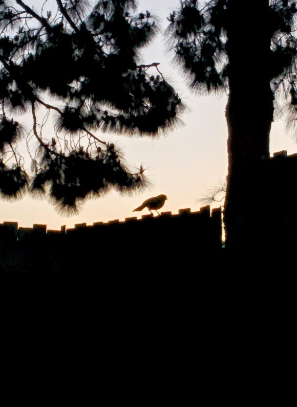
5. Shape is the definite structure of a subject. The shape of the flower is clearly seen in my picture, as it stands out against the background. Form is more about how the structure of the subject interacts with its surroundings. The tree in my picture goes well with the sky and therefore demonstrates form.

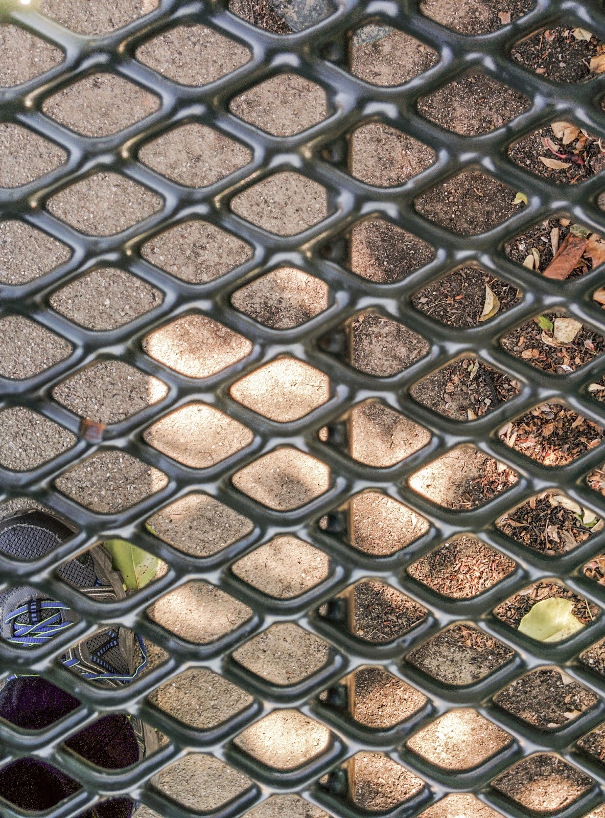
6. Pattern is a uniform series of identical geometric shapes that fit well together and are very numerous. The repeating diamonds on the benches is a very good example of pattern. Repetition is less strict than a pattern. The objects or shapes appear multiple times, but do not have to be exactly the same or connected to each other. In my picture, the caution tape sign repeats, but not in the same way or at regular intervals.

7. My Weebly About Page.  One Photographer who inspired me was Dorothea Lange. This is her About Page

8. Commercial Shoot
    Presentation Project
    Final Project

I think my best work is the Final Project. This is because out of these three projects, I enjoyed photographing my pet birds the most. I also think I got the highest quality pictures from this project. The final picture of the Final Projects, the one seen in #4, helped me see a new way of photographing: getting up close to the subject and using a shallow field of depth to focus on them.


Friday, May 29, 2015

Student Website Reviews

Period 1

Ashwin

This site is clean and simple. The gallery is easy to view and the pictures are organized well. I like the picture of the lock because the lock is red and the locker is green, giving a good sense of contrast.
Period 2

Amin Khan

This site is very well planned and thought out. The about page has a detailed description of him and the gallery of photos is easy to find. There were two problems with his website. The first one was that the button labeled "Galleria" did not work. It was misleading and just a label. The other problem was that the gallery was disorganized. My favorite picture was the one of the shoes on the shoebox in the grass because the proportions of the objects in the picture is good.


Period 3

Jasmit Tamber

This site is also well planned and thought out. The "gallery" buttons work here and lead to the page of the gallery of his project. However,some of the pictures are too small and the front page is disorganized. My favorite photo is the one in the bottom right of the front page of the plant close up. It is good use of depth of field.

Wednesday, April 29, 2015

Backdrop

Original

Camera Raw Edit

Exposure +.95
Contrast -55
Vibrance +17

Photoshop Edit

Cropped


Thursday, April 16, 2015

Story with a photo- Multicultural Week


This guy ate some orange chicken and rice at Mission San Jose's Multicultural Week and thought it tasted good but was too small for the price of 3 tickets. Therefore, the next day he brought a burrito which was larger for the price. He learnt an important lesson. Don't buy overpriced food. Then the next day he brought something else.
This guy drank something

This guy is buying something.


Some of my teachers did not think multicultural week was important enough to stop giving homework.
I made my photos of multicultural week look good before posting them on here.


Wednesday, April 15, 2015

MSJMCW Story

Multicultural week is a week where clubs and groups sell food from different cultures at inflated prices.  On Monday i brought orange chicken and a cake. On Tuesday I brought a burrito and a cake.  I also brought orange chicken and a cake for my friend. Today I plan to buy a burrito and cake again.


Thursday, April 2, 2015

Shutter Speed and Everything After

Partner - Yuvraj
1. Shutter speed is fast- the trucks are moving but they seem to be still in the picture

2. Karthik- One rule of composition I see in this photo is depth. The truck farther away is visually smaller than the one that is closer to the photographer.

Yuvraj - Subject off center- the crashed truck is not the center of the picture, but is the main subject.

3.Many lines are seen in this picture. The divider is a line, and the roads have many lines on them.

4. There is repetition in this picture- the supports for the divide repeat at regular intervals all the way into the background.

Tuesday with Farley's kids

Shutter speed is probably 1/250

Friday, March 27, 2015

Principals of Design - Unity

Original

Edited


Temperature -8
Tint +2
Vibrance +52
Saturation +29

This picture represents unity. Each part of the picture plays a role. The bird is perched on a fence. The tree is the natural habitat of this bird. The sky is where the bird flies.

Principals of Design - Variety

Original

Edited


Exposure +.4
Contrast +32
Highlights -25
Shadows +24
Vibrance +22

This photo shows a variety of principals of design. It shows movement, because they eye will follow the picture from the closer objects, like the flowers and building, to the further objects like the trees and bell tower, and finally to the mountains in the background. The pattern of the pink flowers shows repetition and rhythm. There is unity of all parts, and that helps show that this is a school.
The four principals of design its shows are movement, rhythm, repetition and unity, giving it the principal of design of variety, which is the use of several principals of design.


Documenting the Blues in the Mississippi Delta - Variety

Photo 2 shows variety.

This photo shows various principals of design. The first one is movement, where the eye moves from the closer person, to the further person, to the fish, to the trees in the water, to the river, and finally to the background trees. The second principal of design shown is repetition. The river has a repetition of waves and ripples that repeat throughout the water. The small waves also show rhythm, in the way they rise and fall and add a musical element to the photo.

Wednesday, March 25, 2015

Principals of Design - Rhythm

Orignal
Edited


Exposure +.7
Contrast +58
Highlights +100
Shadows -51
Clarity +44

Monday, March 23, 2015

Movie Monday Half Past Autumn Part 3 and 4

Part 3 and 4


1.What is your definition of successful?

Getting good grades

2.What have you given up to become successful?

Nothing

3.What did Parks give up to become successful?

his safety, stable life

4.Who was Genevieve Young's father?

He was a rich business man.

5.How much was Parks advanced to write his first book (and eventual best-selling autobiography)?

He advanced to $10,000 for the first 7 pages.

6.How much money did Elijah Muhammad offer Parks to do a story on The Nation of Islam?

$50,000

7.Why did Parks refuse the money?

He didn't believe in the religion and felt like it was wrong. 

8.What was significant about the movie The Learning Tree?

It was his first movie

9.What was significant about the character Shaft?

he was a black superhero

10.What was Gordon Parks' choice of weapons?

Photography and nonviolence

11.What reason did Genevieve Young give for the divorce?

She couldn't keep the turmoil and uncertainty of day to day life under control.

12.In 1984, Parks directed Solomon Northrup's Odyssey. What recent feature film told the same story?

12 Years A Slave

13.Who was Gordon Parks, jr?

Gordon Parks son, filmmaker, died in a plane crash

14.What is your favorite Gordon Parks photo?

American Gothic

15.What will you remember about Gordon Parks in ten years?

nothing

Friday, March 20, 2015

Principals of Design - Proportion

Original
Edited


Exposure +.4
Contrast +100
Highlights -44
Blacks +16
Saturation +34

There is a Propotional amount of natural plants and human made structures in this photo.

Thursday, March 19, 2015

Principals of Design - Repetition

Original
Edited


Temperature -12
Tint +19
Exposure +.6
Highlights -2
Shadows -55
Whites -29
Blacks -47
clarity -9
vibrance +3
Saturation +9

I used the straighten tool to make the yellow lines straight
The word caution is repeated along with the yellow lines

Principals of Design- Pattern

Original
Edited


Temperature +19
Tint +6
Exposure +.6
Contrast +50
Highlights -29
Shadows +100
Whites -100
Blacks -14
clarity +43
vibrance -36

pattern of bench, edited to make the pattern stand out from the background

Tuesday, March 17, 2015

Principals of Design -Movement

Original
Edited


Tint -28
Exposure +.65
Contrast -36
Highlights -35
Shadows +12
Whites +43
Blacks +40
Clarity +51
Saturation -16

The viewers eye will follow a path and  will move from the wall to the tree to the parking lot in the distance. I edited to make the background more clear so it catches the eye eventually.

Wednesday, March 11, 2015

Principals of Design- Emphasis

Original
Edited


Temperature -4
Tint +11
Exposure +0.25
highlights +28
Shadows -58
Whites -55
Blacks -36
Clarity +33

I cropped the photo using the straighten tool to make the bar horizontal.

This photo places emphasis on the bar because i used a shallow depth of field to make the bar in focus and the background blurry.

Tuesday, March 10, 2015

Principals of Design- Balance

Original
Edited


Exposure : +1.30
Contrast: -100

This picture shows balance. Half the picture is sky and the other half is roof, giving an even feeling of closeness and distance in the picture, giving a feeling of depth as well as balance. 

Friday, March 6, 2015

Elements of Art - Texture

Original
Edited


Tint -13
Contrast +30
Clarity +100

I edited to make the rough texture of the plant very clear. Increasing the clarity increases the visibility of the texture


Thursday, March 5, 2015

Elements of art Color

Original

Edited


Temperature +10
Tint -35

We had to take a picture with green in the bottom right. I edited to make the green tree more green

Wednesday, March 4, 2015

Elements of Art - Space

Original
Edited

Temperature +10
Tint +14
Exposure +0.65
Contrast +6
Highlights -27
Shadows +27
Whites +25
Blacks -9
Clarity +22
Vibrance +58
Saturation +53

This picture represents space by having two clear objects, the foreground of plants and the background of the building. The shadow and height difference helps create a sense of depth. The white wall gives negative space